Learning Analysis
Settings
Introduction
The Learning Analysis (Settings) tab suggests which settings are significant to the goals. Users can adjust the values of the settings based on this analysis.
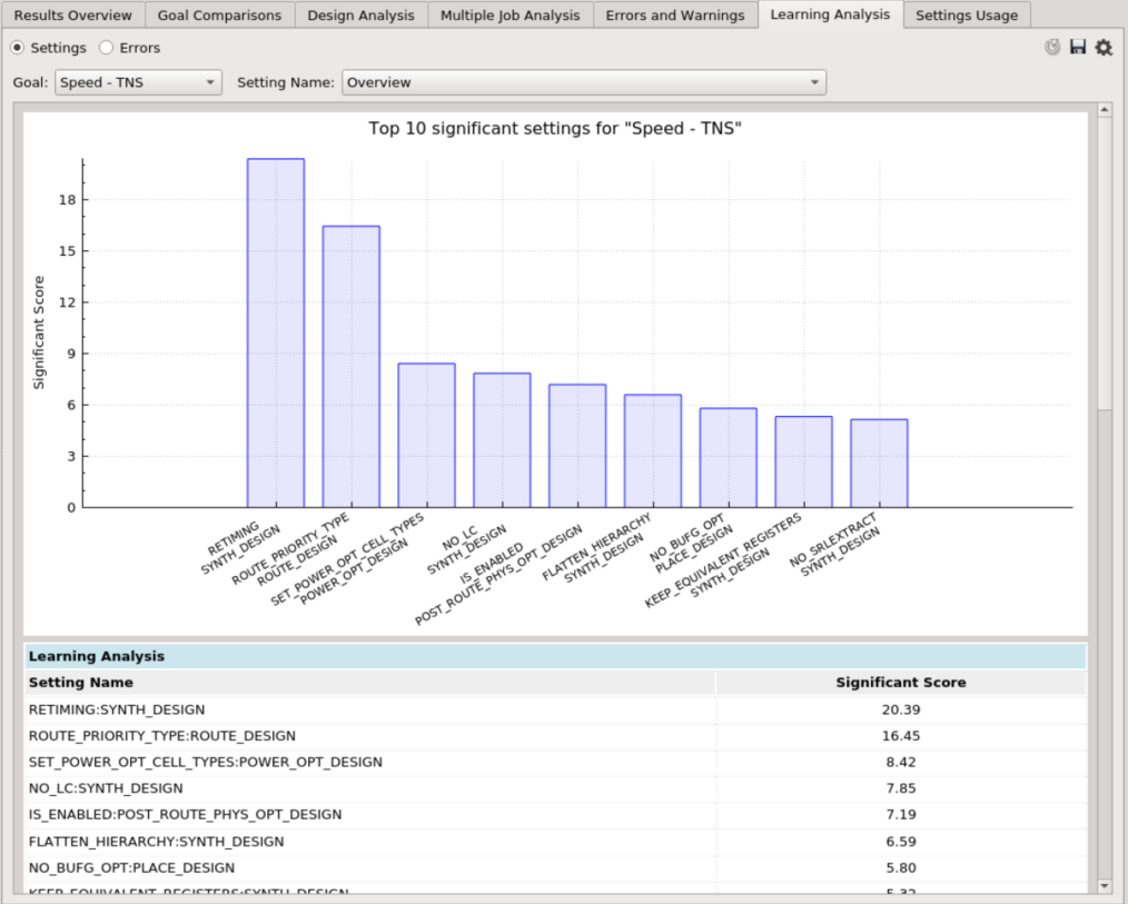
Overview Chart
This chart shows the top 10 settings, where a higher score means that that particular setting is more significant towards influencing the goal. Users can click a bar to find out the value with better or worse results. Fully-ranked settings are shown in the table below.
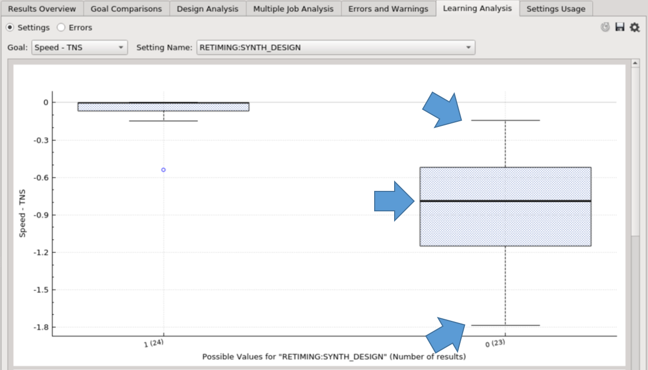
Settings Chart
Each setting shows the distribution of results for every possible value. There are three main lines denoted by the blue arrows. The topmost line is the best result of this value, the black thick line is the median (50th percentile), and the bottom line is the worst result of this value.
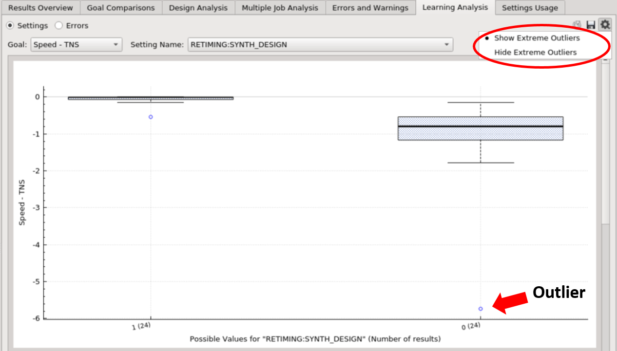
Users can toggle between “Show” / “Hide Extreme Outliers” (values that are far from other values). Hiding outliers is the default behavior so that the chart is easier to comprehend.
Errors
Introduction
The Learning Analysis (Errors) tab suggests which settings are significant in terms of the errors, or a certain error category. Users can adjust the values of the settings based on this analysis.
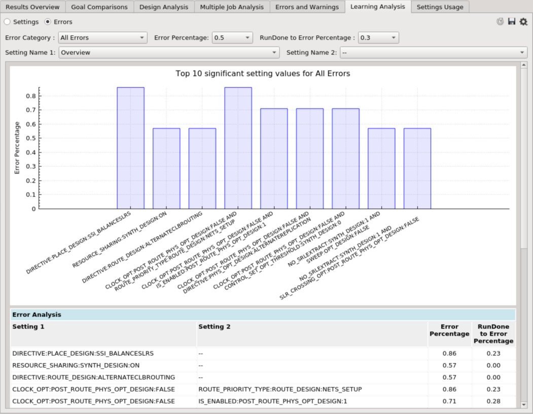
Overview Chart
The overview chart shows the top 10 significant settings’ values. There are two parameters to adjust for this chart:
-
Error Percentage - the usage percentage of a setting’s value among all error results. Setting values above this percentage will be shown in the chart, and a higher percentage gives a stricter restriction.
-
Example: if the value is 0.5 (meaning 50%), it means that if X setting is used more than 50% of the time in the erroneous results being analyzed, it will be in the analysis.
-
RunDone to Error Percentage - RunDone Percentage (the usage percentage of a setting’s value among all successful results) divided by the Error Percentage. Setting values below this percentage will be shown in the chart, and a lower percentage gives a stricter restriction.
-
Example: if the value is 0.3 (meaning 30%), it means that if the ratio of the percentage of X setting in the successful results to the erroneous results is less than 30%, it will be in the analysis.
Users can click a bar to view a specific setting’s usage for both erroneous and successful results. The fully-ranked setting’s values are shown in the table below.
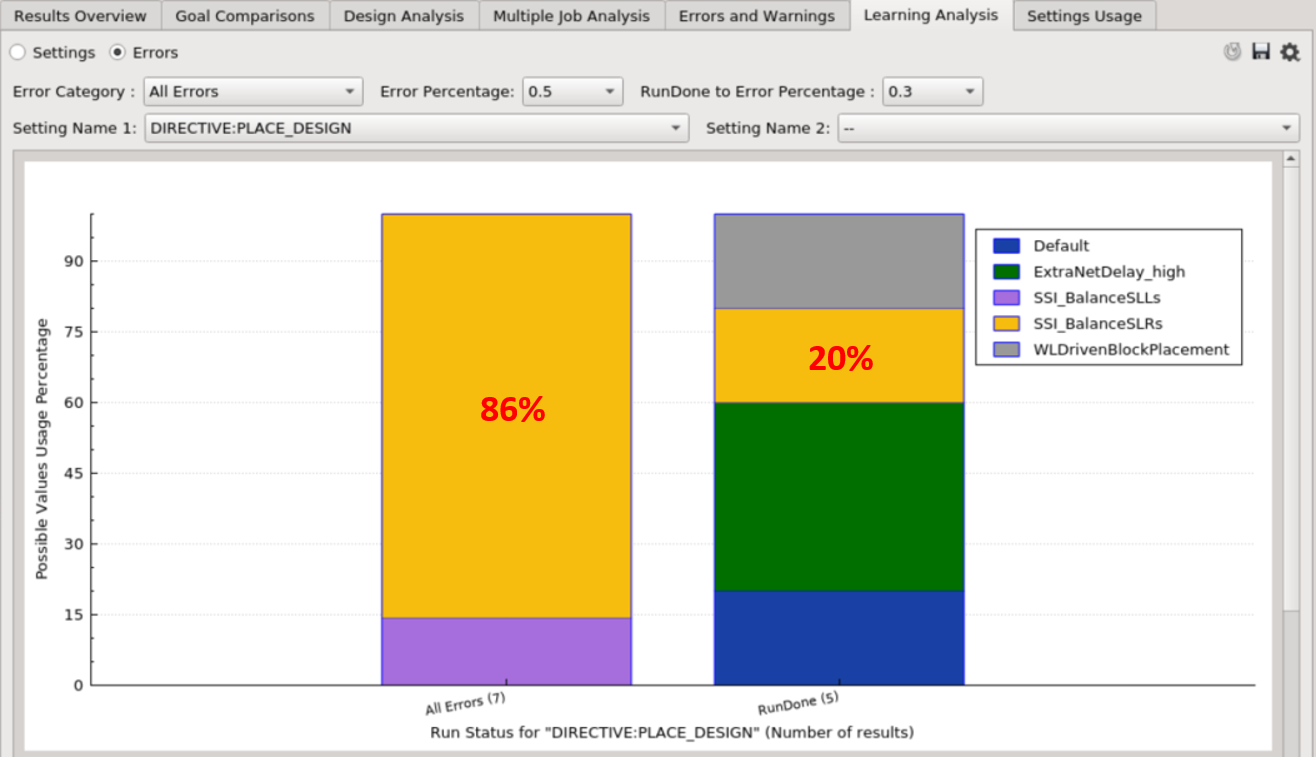
Settings Chart
Each setting’s chart compares the usage of the values between erroneous and successful results. A value is significant to the error if it has a high Error Percentage (the yellow box on the left), and a low RunDone Percentage (the yellow box on the right).
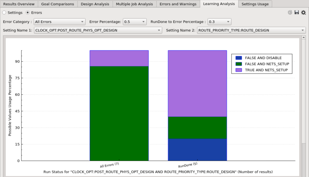
There is also an option to compare the usage of the values between two setting combinations. Each color within a bar represents the possible value combinations between two settings.
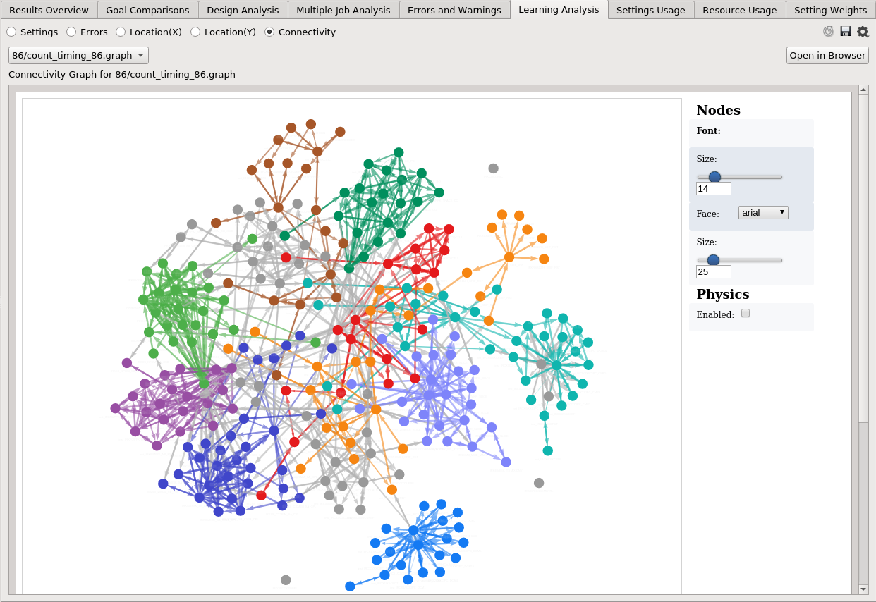
Connectivity Graph
Introduction
The Learning Analysis (Connectivity) tab shows a connectivity graph that represents the selected strategy. This is to assist users who are floorplanning their design, to visualize the design hierarchy from two aspects:
- Connectivity - How different design instances are connected.
- Timing - How critical is the connection between the 2 instances.
Different revisions and floorplanning options will generate different graphs depending on the level of hierarchy being analyzed, and/or how critical are the connections between any two instances.
Generate .graph files
The graph visualization is generated from a file (.graph). This file is automatically generated with the auto_floorplan recipe with the congestion mode (see Tcl reference: fp_type = congestion). After adding the job to the analysis, all available .graph files are listed in the dropdown menu for selection.
Otherwise for other strategies, users need to run this Tcl command, misc gen_connect <job id> <revision name> to generate the required files.
How to read the Graoh
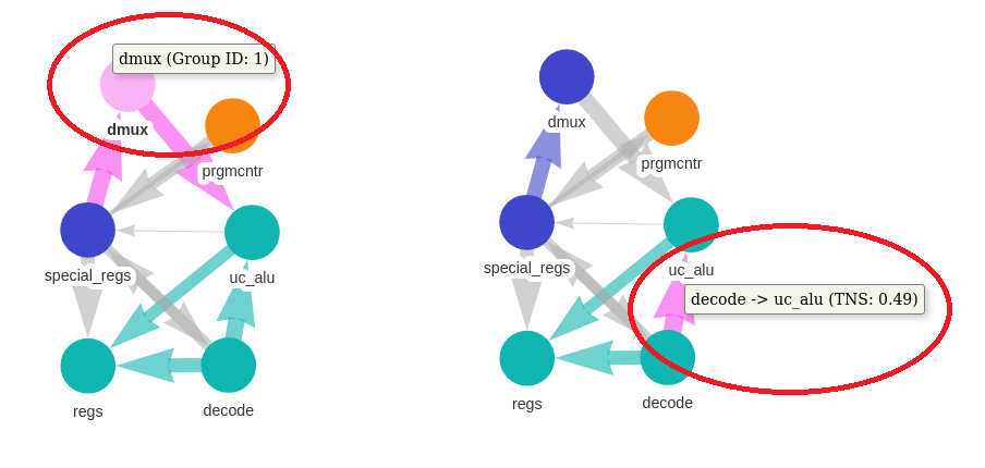
- Each node represents an instance, and two instances are connected with a directed edge if the source instance is connected to the target instance.
- A thicker edge means that the timing from the source to the target is worse.
- Nodes that are highly connected to each other form a group and are labeled with the same color.
Users can adjust the size and font of a node label, as well as the size of a node in the rightmost panel. Nodes can be dragged to adjust the layout of the graph, and can be reset by checking the Physics (Enabled) option. Users can also select multiple nodes by holding the ‘Ctrl’ key, and drag the selected nodes all at once.
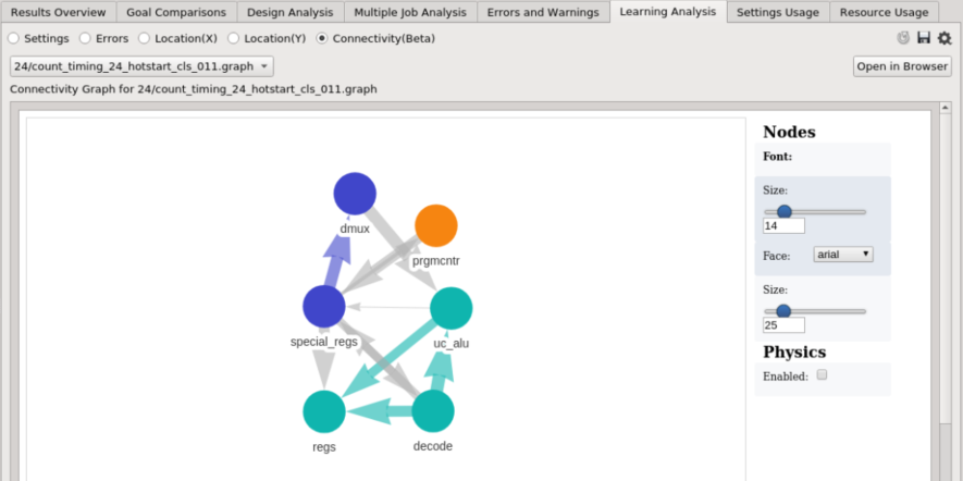
Users can click a node to see which group it belongs to, or click an edge to see the timing from the source to the target.
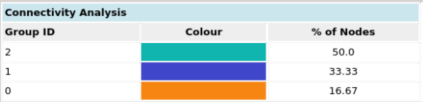
The table below the graph explains the colors, and the corresponding percentages of the number of nodes in each group.
The screenshot below shows a bigger design with 280 instances containing 1412 connections, and how the instances are connected to one another. Groups of densely-connected instances are labeled with the same color.