Analyzing InTime Results
Introduction
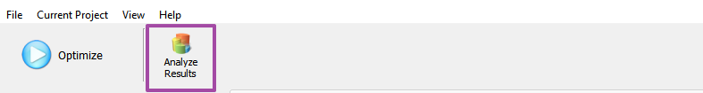
To analyze InTime results, there is a Results Analysis interface. To switch to this interface, click on the button "Analyze Result" in the InTime GUI.
A new GUI below will be displayed with 5 tabs.
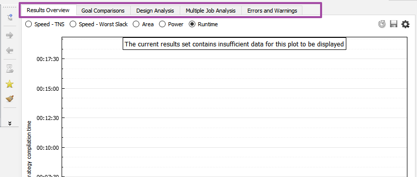
Here is a brief description of the different analysis and charts.
| Tab Name | Description |
|---|---|
| Results Overview | Plots a chart of all the runs showing TNS, Worst Slack, Area, Power, Runtime. |
| Goal Comparisons | Plots 2 different design attributes against each other. The attributes supported are TNS, Worst Slack, Area, Power. |
| Design Analysis | Analyzes the critical paths, multi-die, fanout across the select runs. |
| Multiple Job Analysis | Provides an overview and progress of the whole optimization process. |
| Errors and Warnings | Aggregate all the warnings and errors to give an overall view of the design. |
Add Data for Analysis
Before viewing any analysis, select and add results data to the analysis dataset. There are 2 ways to choose the jobs or results.
-
Right-click on a existing job/strategy, and choose
Analyze Job <Job ID>. This will only add this job (and its child jobs) to the pool of data to be analyzed.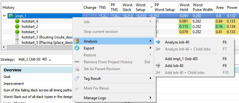
-
If you have existing data in the analysis set, you can also add additional multiple jobs for analysis simply by using the
Add Job <Jobd ID>option. To add a single strategy, just click on the strategy and select theAdd <strategy name>option.
To clear the Analysis, go to View, Analysis and Clear Current Analysis
Analysis Types & Charts
Results Overview
The "Results Overview" will automatically plot the values in a chart. The purple column is the original parent revision. The green columns represent results better than the parent revision and blue means worse. Selecting a column will reveal what is the actual value as well the difference between this and the parent revision.
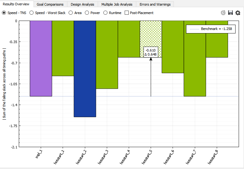
Post-Placement Estimates
For TNS and Worst Slack, there is an additional checkbox called "Post-Placement". This will plot the post placement timing estimates on the same chart.
Goal Comparisons
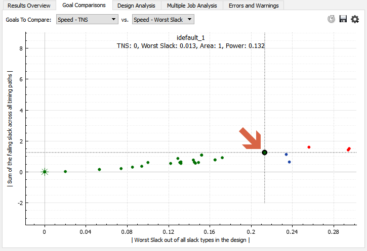
To understand where is the sweet spot between Area and Timing, the "Goal Comparison" chart can help provide insights. In the chart below, the dot indicated by the red arrow is the starting revision. All the points that are better for both axis will be coloured green. Blue is for one axis and red is if it is worse than the original on both axis.
Design Analysis
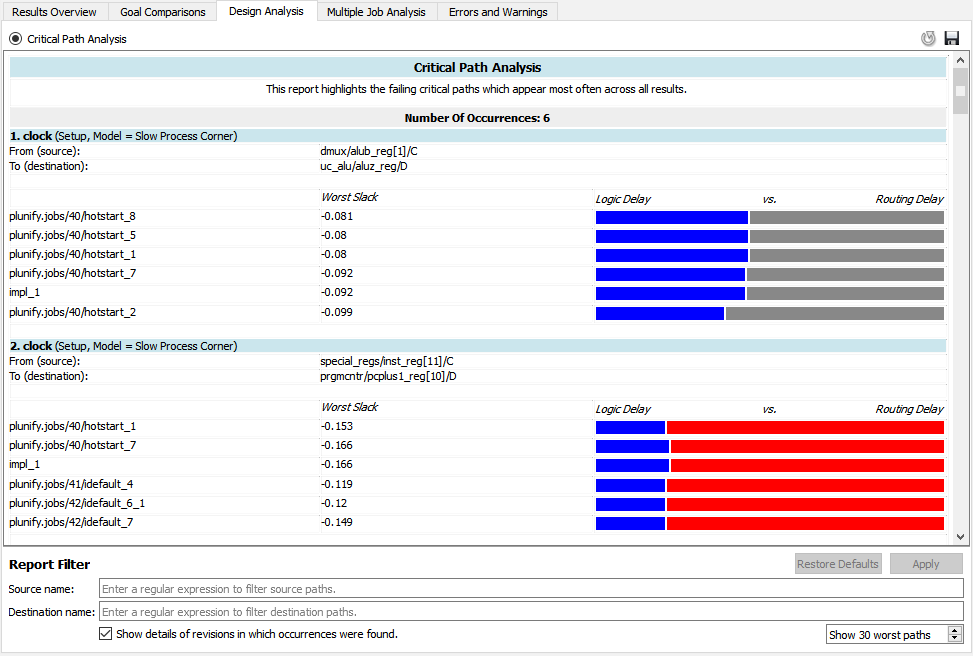
Critical Path Analysis
The Design Analysis tab provides insights on the critical paths in the design. The goal is to highlight the occurences of the same critical path in the multiple builds. Refer to the Critical Path Analysis page to understand more.
Multi-die Analysis
For Vivado devices with multiple dies, this analysis provides insights into the SLR crossings and how it affects the overall timing and performance. Refer to Multi-die Analysis for more details.
Fanout Analysis
InTime classifies the fanout into 4 different severity groups. This chart provides an insight into how different fanout levels are correlated with the performance of the design.
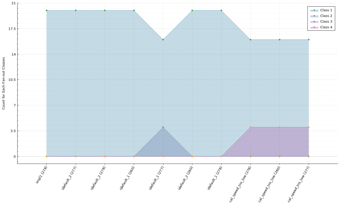
| Class type | Description |
|---|---|
| Class 1 | Fanout is less than 125 |
| Class 2 | Fanout is greater or equal to 125 and less than 250 |
| Class 3 | Fanout is greater or equal to 250 and less than 500 |
| Class 4 | Fanout greater than 500 |
Logic Level Analysis
InTime classifies the logic levels into 4 different severity groups. This chart provides insights into how different logic levels correlate with the design's performance.
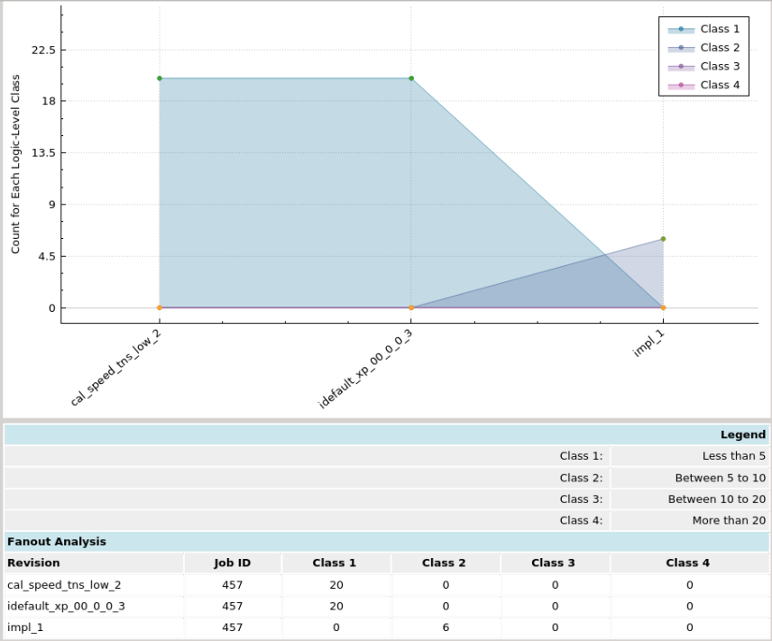
| Class type | Description |
|---|---|
| Class 1 | Logic Level is less than 5 |
| Class 2 | Logic Level is greater or equal to 5 and less than 10 |
| Class 3 | Logic Level is greater or equal to 10 and less than 20 |
| Class 4 | Logic Level greater than 20 |
Multiple Job Analysis
Provides an overview and progress of the whole optimization process. In this chart, each job is denoted in a column. (Note that the Y-axis of the chart inverts the negative values) There are 3 main lines in this chart (denoted by the blue arrows). The red line indicates the worst result in this job. The black thick line is the median (50th percentile) and the green line is the best result of this job.
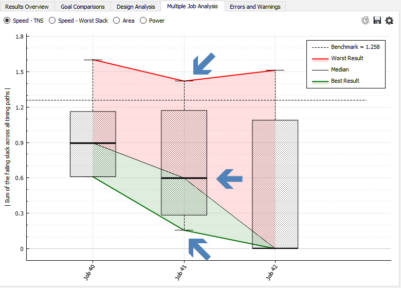
The main use of this chart is to check whether the learning gains are diminishing. One of the key sign is that the black line is plateauing. This usually starts happening after 3 rounds of learning recipe or about 50-80 strategies, e.g. Default.
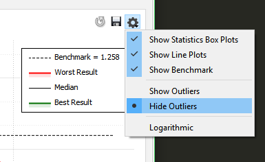
Tip: Use chart settings - Hide outliers
The FPGA tools can give a very wide spread of values for different results, especially for TNS. In the charts below, both are showing the same dataset in the analysis. However, the one on the left includes 1 outlier datapoint. By hiding the outlier, the chart is more intutive and easier to comprehend.

To hide outliers, click on the Settings button, and choose "Hide Outliers".
Errors and Warnings
This tab aggregates all the warnings and errors to give an overall view of the design. Given the high number of warnings, info messages, it is easy to miss out important warnings, such as "critical warnings". Aggregating the warnings gives a fast, simplified and straightforward grasp of the important warnings and errors. For example, if a critical warning in placement is happening across all the strategies, it is an indication of a design issue.
An explanation of the columns is provided below.
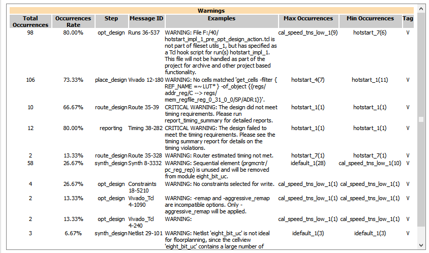
| Column Names | Description |
|---|---|
| Total Occurrences | The total number of occurences across all the results in the analysis. |
| Occurrences Rate | The overall occurrence rate (%) across all the results in the analysis. |
| Step | FPGA flow step where this happened. |
| Message ID | FPGA vendor specific warning or error ID. |
| Examples | Sample warning or error message. |
| Max Occurrences | Strategy with the maximum number of occurences. |
| Min Occurrences | Strategy with the minimum number of occurences. |